Sephora

Stores & Services
Find a Sephora

Happening at Sephora

View all

Services

From makeovers to personalized skincare consultations

Free Classes

Get inspired, play with products & learn new skills

cancel
Showing results for 
Search instead for 
Did you mean: 
Post in Trending at Sephora
|

Beauty Insider Community Feedback

Hello beautiful Beauty Insider Community members! 


We’re starting this thread for you guys to report any issues and weird things that you are seeing or ask any questions. We have a number of issues logged that we are already working on a fix for, so this is a work in process.


Some things to note as you are reporting issues:

  • If you are looking for a thread and can’t find it, please post here. We’ll need to manually move some threads that got lost in the migration to their correct groups.
  • If you are reporting a bug please be specific about the issue you're seeing, how you got there (“I clicked here and it did *this*”), the device you're using and which browser you're in. 


Some tips:

  • If you are looking for a thread that you commented on in the old community, go to the front page of conversations and click the “My Posts” tab. This is where you will find all of your conversations activity, including your heart count.


It’s good to see you all and thanks for being patient!


Whenever reporting a bug we need as much info as possible or our tech team cannot reproduce the issue and verify it's actually occurring. If they can't see the issue they cannot fix it. You cannot overshare details, test on too many devices or share too many screenshots... The more detail the better!

Re: Beauty Insider Community Feedback

Hahaha fun fun. Thanks @WinglessOne!

Re: Beauty Insider Community Feedback

Ello!

On the desktop, I haven't tried mobile/app so maybe someone can chime in on that, but the messages area doesn't seem complete to me. I can click a little square box, as though I am going to delete or mark as read, but no options come up at all. Anyone else have this problem?

Re: Beauty Insider Community Feedback

Oooh, would you mind taking a screenshot of what you're seeing @Samtian? Want to understand exactly what is being displayed on your end so we can share with our vendor partners if needed. 😊 Thanks! 

Re: Beauty Insider Community Feedback

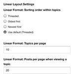
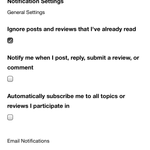
@GeorginaBT Hope this helps! I have one message clicked, but no options to do anything with it. I've included a shot of the beginning and bottom of the page.

PM 1.pngPM 2.png

Re: Beauty Insider Community Feedback

An odd experience indeed, @Samtian! Thanks so much for these screenshots - passing onto our vendor partners so they can take a look. 

Re: Beauty Insider Community Feedback

@GeorginaBT Thank you!

Re: Beauty Insider Community Feedback

Whew, thanks again for bringing this to our attention @Samtian! We confirmed it to be a bug, and the checkboxes should no longer display in your private messages inbox (seeing as there is currently no option to action off selected messages)! Please just let us know if you're still seeing the checkboxes~ 😊


Re: Beauty Insider Community Feedback

@GeorginaBT All gone! Thank you!

Re: Beauty Insider Community Feedback

@KatieBT  @TeamBIC 

Now that I’ve played with the s/xs (phone) mobile view of BIC and Sephora.com, I can share feedback. I’m sure some of this has already been mentioned by others but, um, this view of BIC has some navigation usability issues. 


How I tested:
Spoiler
I very rarely reply to BIC threads via phone and don't often browse BIC that way. I'm much more of a tablet and desktop (laptop) BIC user. I need my space! 🤣 And my full-size keyboard!

But for feedback purposes, I did browse quite a bit via Google Chrome on an iPhone XS running iOS 13.5.1. Hey, I even replied to a couple threads via phone! I didn't try to upload any photos, though. I was too frustrated by the nav issues I'm about to mention to attempt messing with photos, especially since I know how photos work on the tablet/desktop (medium/large/xl) views. 
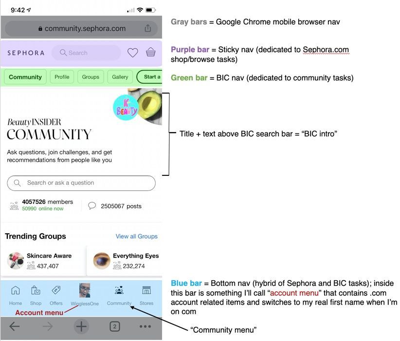
First, lemme define the nav areas I’m about to talk about so I don't confuse anyone (including myself): 
Edited with photo + legend together, because not having the legend beside the photo bugged the heck outta me :DEdited with photo + legend together, because not having the legend beside the photo bugged the heck outta me 😄
 
Okay... 
 
1. In BIC, the sticky nav’s Loves and Basket icons aren’t needed. Well, unless you’ve got data showing that many BIC members access those 2 pages from BIC pages. But I’m guessing those aren’t pages most folks need permanently pinned to the top of BIC. They’re much more important when folks are in shop/browse task mode over on .com. 
Spoiler
Sure, some folks also “shop” from BIC: we see tagged products that interest us. But we don’t need to visit our loves or basket at all to read more about those products or add them to loves, and we can't add products directly to cart—err, basket—via tags in threads. (I wouldn't want to be able to do that, honestly.) 

Then again, I have seen a couple threads from folks asking how to access their loves list. And some of us use that list as pre-cart (basket) prep, or to build fantasy carts for certain threads (where we share screenshots). So okay, maybe loves isn't completely unnecessary. But is it sticky nav necessary? Eh... 

And now I wonder how many folks check out from BIC pages vs. .com pages. I’m genuinely curious if a sticky basket link is needed after all. I don't expect y'all to share your stats with us 🤣 but that doesn't stop a gal from wondering! 
2. The more helpful sticky nav for BIC would be the notifications icons (bell and envelope). I don’t like that they’re hidden in BIC nav until I swipe through that carousel. In fact, the only reason I use the bottom nav at all is to get quicker access to those 2 icons (in the Community menu). I’d rather see those 2 icons up in the sticky nav, replacing Loves and Basket. 
 
2.1. Alternate suggestion: move the Community and account menu icons from the bottom nav to the sticky nav to replace Loves and Basket. The Community menu contains notifications with a number badge, which I find handy. (In the BIC nav, it just has the red dot indicator.) 
Spoiler
I get that squeezing the account menu into the sticky nav is tricky because it displays BIC usernames, which can be long. But thats also an issue for the bottom nav, and I assume there's a solution in place for that, so... 🤷‍♀️

This suggestion still puts notifications a tap away, so it's not ideal. I'd love to have notifications as sticky links instead. I suspect many BIC users feel the same. 
3. "But what about the sticky shopping bag link!" Yeah, it's the only thing missing from the account menu. If it's reeeeally a necessary sticky link... 
 
  • Getting a 3rd icon (Community, account menu, and Shopping Bag) into that sticky nav space would be hard without significantly shrinking either the search bar or icon sizes (and probably losing the personalization of first name/BIC username). 
  • Putting just the Community menu and Shopping Bag icon in that space (no account menu) means losing persistent access to everything in the account menu—but only while users are in BIC, unless this design is also carried to .com. 
  • Or hey, why not slot the shopping bag link into the account menu. This puts it a tap away but, again, how often do folks go directly to shopping bag from BIC pages? 
Spoiler
Something tells me all these suggestions mightve been floated in your pre-launch design iterations. I can almost hear a designer moaning about how tight that space is, and wondering if the search bar can’t be reduced to an icon that expands when tapped (and collapses when tapped again), and a UX debate about what’s more important: search field access/functionality or certain persistent nav links.

Not that I’ve ever had to oversee or advise on such a discussion in my previous life, noooo, not me… ugh. 
4. Whatever happens in sticky nav and/or BIC nav, the bottom nav can be removed from BIC. Persistent bottom nav can be super annoying to people regardless of the task they’re trying to perform because it visually interferes with content people are trying to see as they scroll down. On .com, maybe that nav could replace BIC nav: move it to the top, below sticky nav. 
 
Caveat: I realize some or all of those 4 nav suggestions disrupt the persistent mobile nav you've got across .com and BIC, especially number 4. But the more I poked around the mobile/s/xs view and saw just how different it is from desktop (I always expect a scaled experience from l/xl to s/xs viewports, but yours includes some interesting sticky nav choices), the more I wondered how consistent nav really needs to be on BIC and .com, considering how differently I assume folks use those 2 sides of Sephora. 
 
5. On BIC homepage, consider shrinking the BIC intro (BIC title, "ask questions, join challenges...") and/or tightening up the spacing in that area to reduce scrolling. This isn't a problem on desktop because there's much more room there. But on mobile, we have to scroll quite a bit to reach threads. Removing bottom nav will also help. 
 
6. Minor item (for mobile and desktop) that’s a carryover from the previous design: Shopping bag icon loses its number badge when I move from .com to BIC. I have no idea if the badge can be carried from .com server(s) to BIC/Lithium server(s)—assuming there are different servers involved—and its not a big deal to me. Just something I keep noticing. 
 
How about something I like? 🙂 The BIC search bar is at the top of each thread. It might annoy some folks, but I hope it encourages new members to search for existing threads before they start their own threads—so we don't end up with lots of "does the $100 rouge reward even exist/why can't I get a rouge reward" threads in the main conversations or rouge group feeds. I'm just sayin'. 
Spoiler
Was the search bar always atop each thread page on mobile, or was this a design tweak? I know it was always atop the conversations feed pages, but I don't recall seeing it atop each thread on my phone. Then again, I'm not normally a BIC-via-phone user, so maybe it's always been this way and I never noticed before. 

Re: Beauty Insider Community Feedback

Totally agree, @WinglessOne!! I do browse and respond on my phone (android OS on a S10+, using chrome). I really don't like how the notifications are hidden away (also that it doesn't do the preview anymore, but takes you to a different page). But I really love the search bar on the top of threads and the overall the ascetic of this is a lot nice than before for web browsing. Thank you for all of the work you put into this feedback!!

Re: Beauty Insider Community Feedback

You are incredible, @WinglessOne. This feedback is glorious - thanks for sharing your in-depth perspective on the mobile experience! We really appreciate hearing directly from you, because of course you all are the ones bringing life to this Community! 


And to answer your question: yes, the search bar on top of threads is new to mobile! 😊

Re: Beauty Insider Community Feedback

Thank you @GeorginaBT ! That search bar is very handy. I noticed it's also atop threads in the desktop view, hooray! 

Re: Beauty Insider Community Feedback

Wow that was a generous amount of excellent feedback, @WinglessOne. I’m thinking you saved LMHV some $$$ right there. I hope you are recognized or valued for your worth, this is good stuff and way deeper than I wanted to dig tonight.

Re: Beauty Insider Community Feedback

Aw, thanks @eshoe ! 😊 I almost mocked up some design concepts before reminding myself Sephora doesn't pay me for any of this 🤣

Re: Beauty Insider Community Feedback

Ha ha, @WinglessOne  - you keep it interesting!☺️

Re: Beauty Insider Community Feedback

@WinglessOne 

The search bar at the top of each page is new (and a welcome addition, I agree!). I'd get annoyed in the past when I'd be reading a thread and realize that there's something I needed to search for, but I'd have to go back to the feed to get to the search bar and track it down. 


@KatieBT @TeamBIC 

Seconding everything here. There's just way too much squeezed into a tiny screen as it currently stands!

Re: Beauty Insider Community Feedback

Thanks for the search bar sanity check, @RGbrown ! You just reminded me of all the times I wanted to give a new BIC member a link to a related thread (if I didn't have it bookmarked) and wanted to search for it, so I had to pop the Conversations feed in a new tab (if I didn't already have it open in a separate tab) for search purposes. 


And really, if nothing else is updated for the s/xs/mobile view, I hope the bottom nav is taken away. Could also code it to hide during scroll-down and reappear on scroll-up (like most mobile browsers' bottom nav). But it's such a chunky nav bar, I'd rather it be completely gone. 

Beauty Insider Community Feedback

I notice that when i go to read replies to any of my comments it takes a really long time to load.

Re: Beauty Insider Community Feedback

@Mellmars1185 We hear you on the slowness in Community! We've been sorting out a loading speed issue for a few weeks now, and while lag has certainly gone down, we are continuing to do what we can to improve. Thanks for this feedback! 

Re: Beauty Insider Community Feedback

@KatieBT I haven't been able to paste images for a while, now.  I thought maybe it was just a gif thing, but it isn't.

Re: Beauty Insider Community Feedback

Hey @greeneyedgirl107 - sorry to hear this experience! Are you getting an error message when you try to upload photos? If so, do you mind sharing that with me? Want to pass this info over to our vendor partners. 
2,328 Replies
testing